Magnify
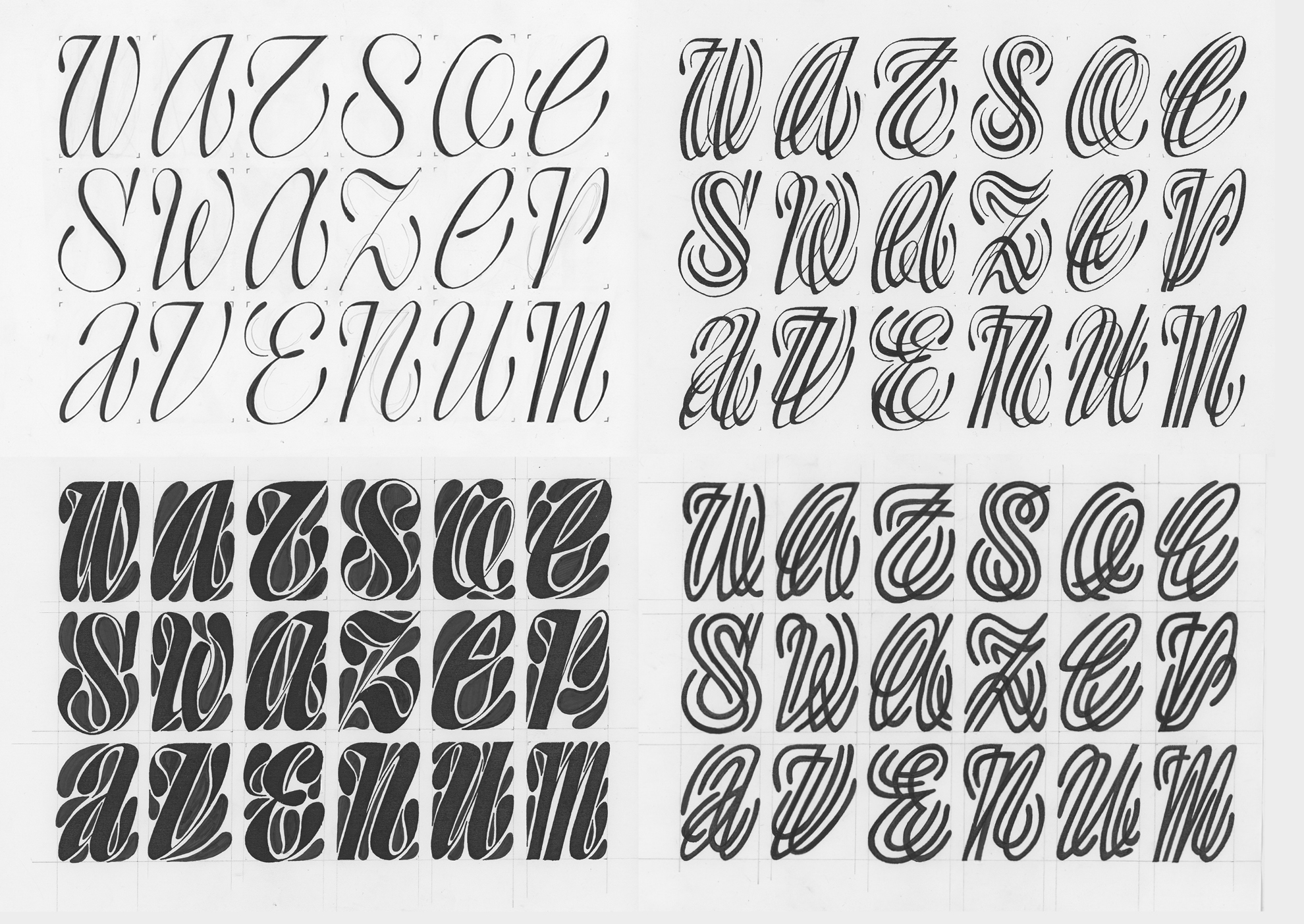
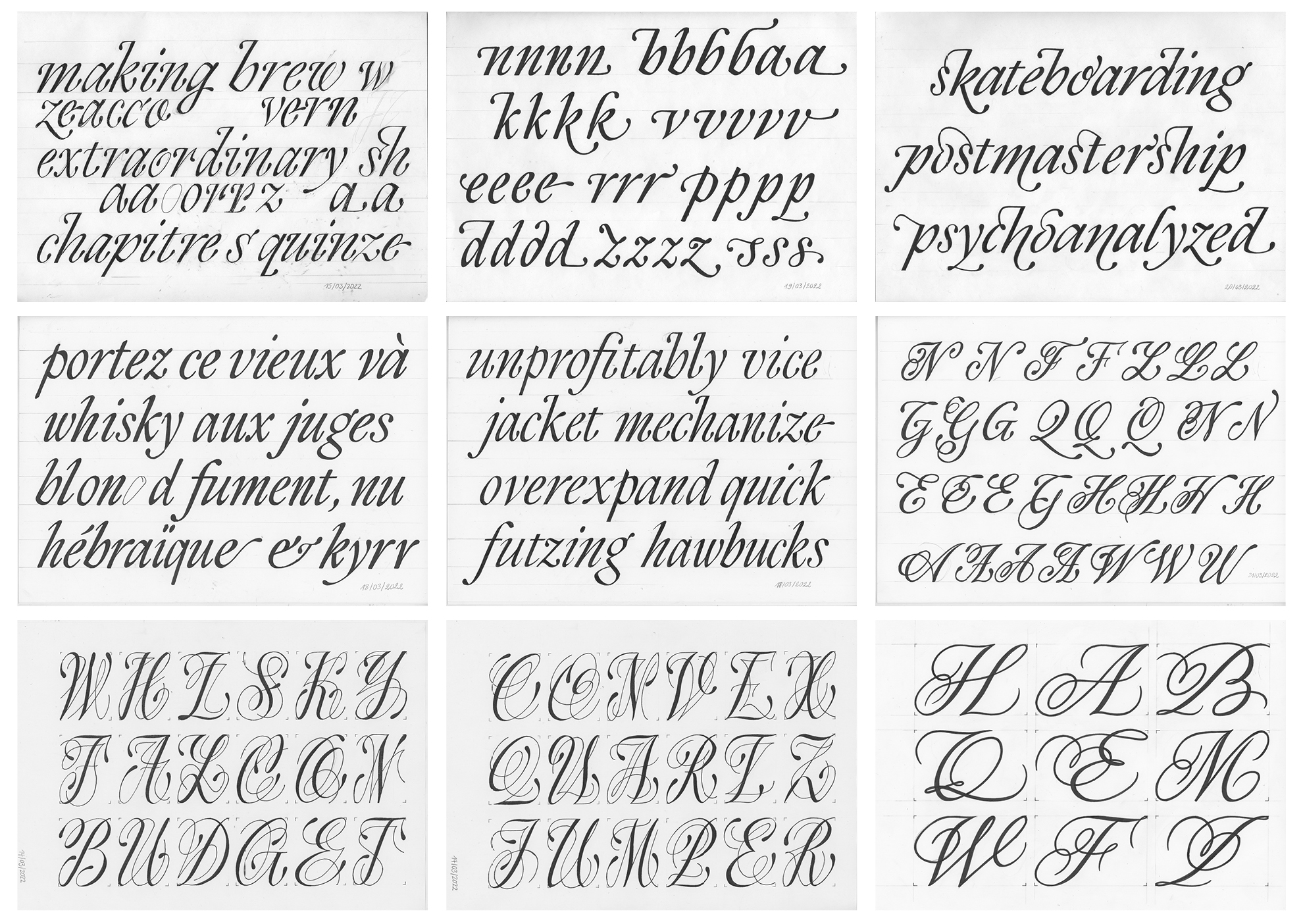
Magnify is an expansion contrast type family born out of an interest for monospace letters and how they behave in a pre-defined box, regardless of their construction. Combining a personal appreciation for script style and pointed nib calligraphy, the project explores how to even the grey value of all the letters by complicating their structure. Indeed, why would you keep it simple when you can make it complicated?
Léa Bruneau
Léa is a French type designer and calligrapher. After studying type and graphic design at école Estienne in Paris, she moved to Hanoi, the capital city of her native country, from where she was working as an independent type designer. When not sitting in front of a computer, she likes to keep her hands busy with all sort of tools, such as chisels, pointed nibs and nunchakus.
Overview
Process
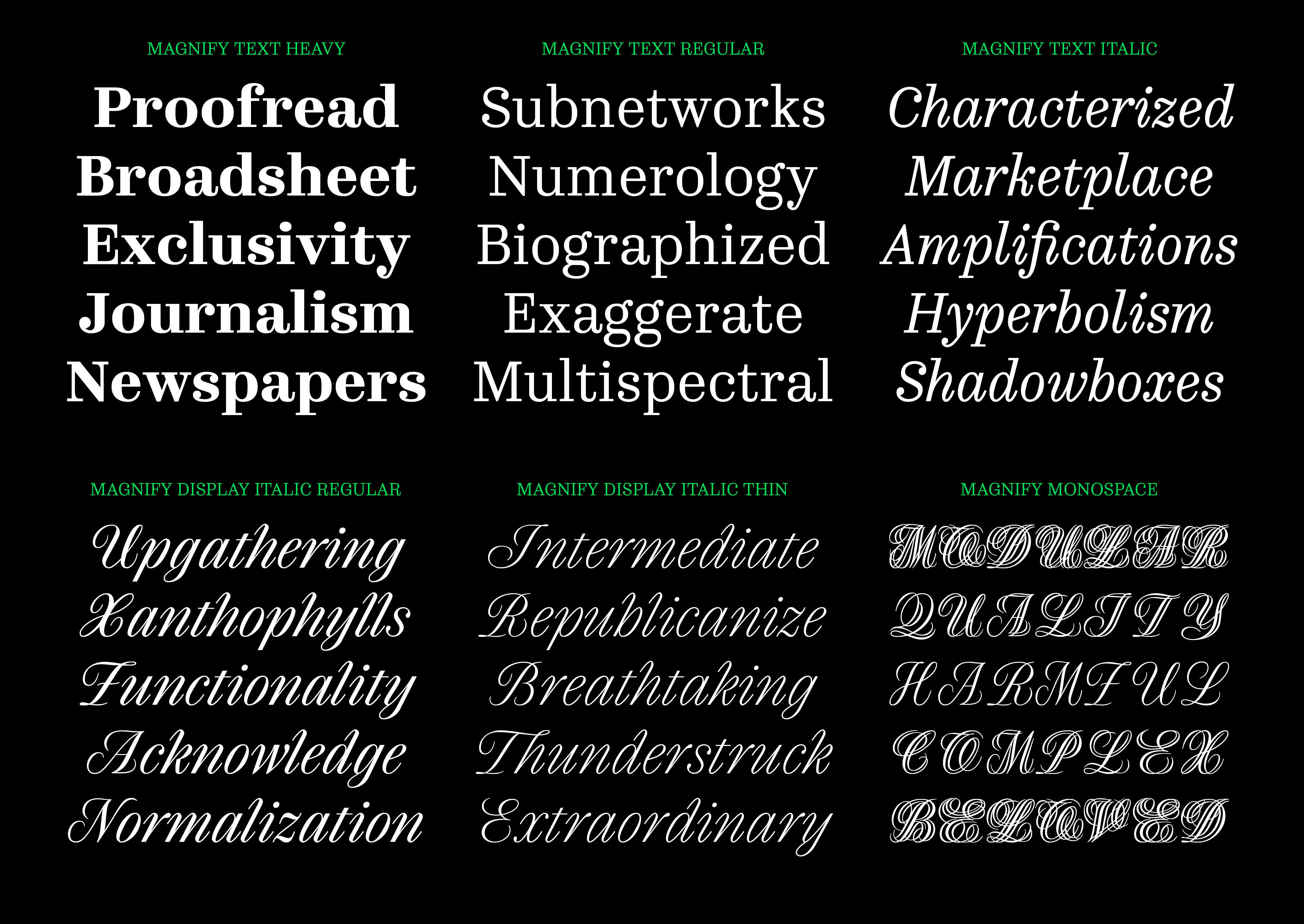
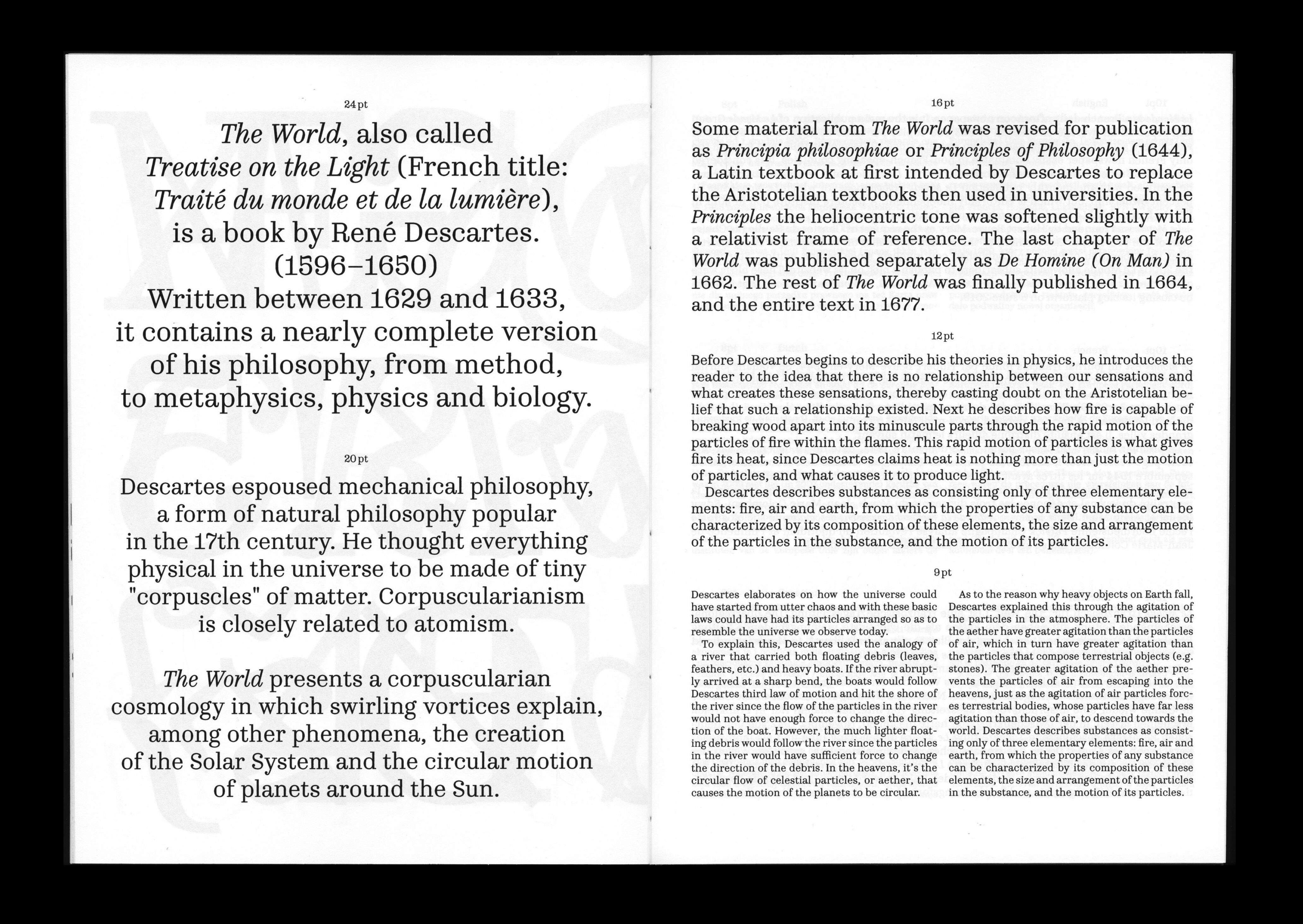
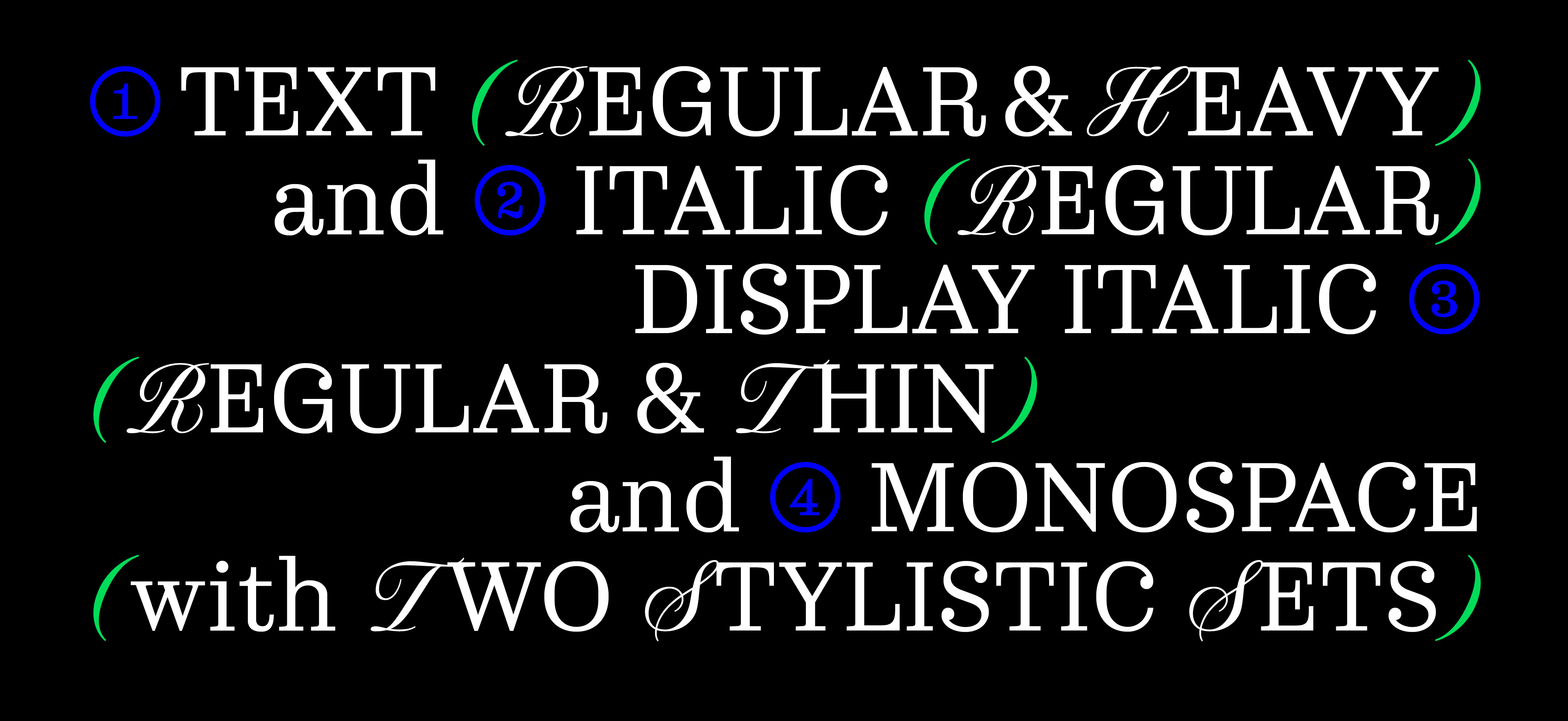
Developed in six styles, the more expressive display styles are complemented by the more conventional text faces. Taking inspiration from the Clarendon, Ionic and Century Schoolbook styles, the roman text retains subtle details such as the drop terminal of the capital letters. The text italic is distinguishable by its variation in the slope axis, which creates a contrasted dynamic when paired with the roman.
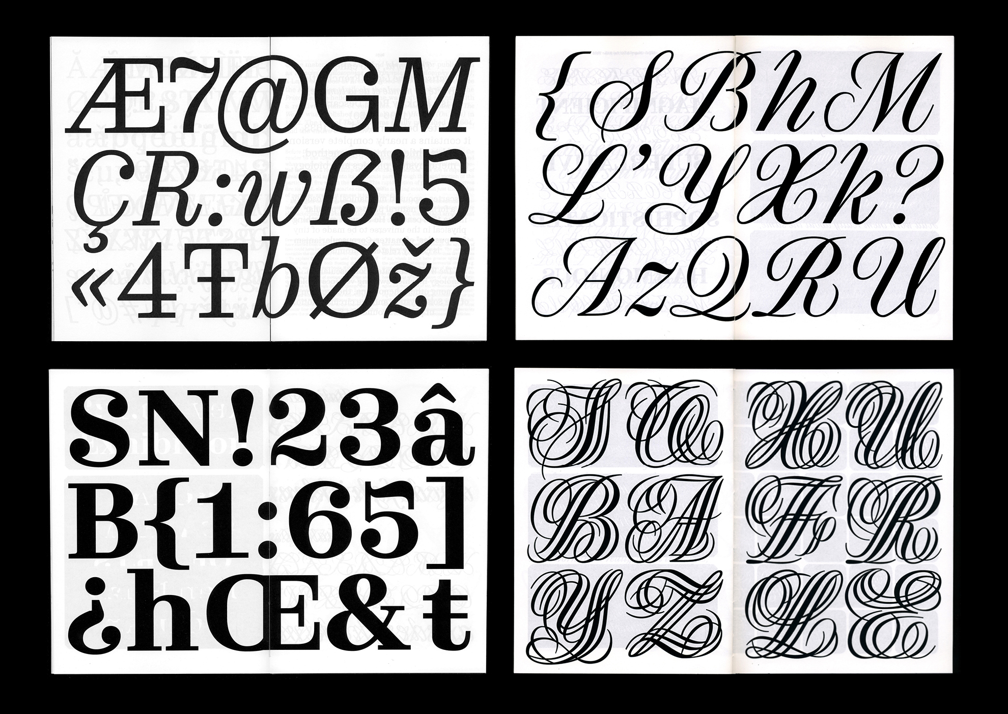
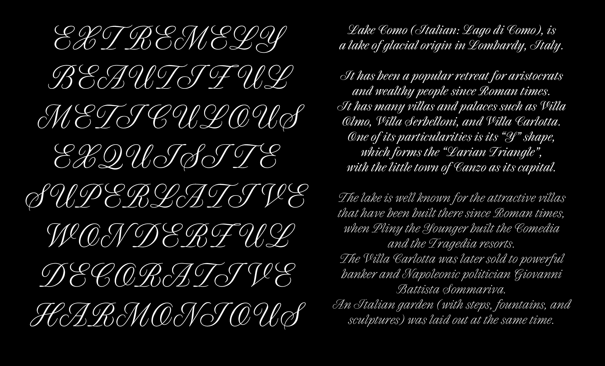
Based on narrower proportions, the display italics are sharpest, spikiest and more consistent in the slant angle, which creates a strong rhythm when set in text. The monospace has two stylistic sets corresponding to two different level of complexity, added to the initial letter structure. This feature allows to play on different grey value for one letter, regardless of their basic construction.