Rubina
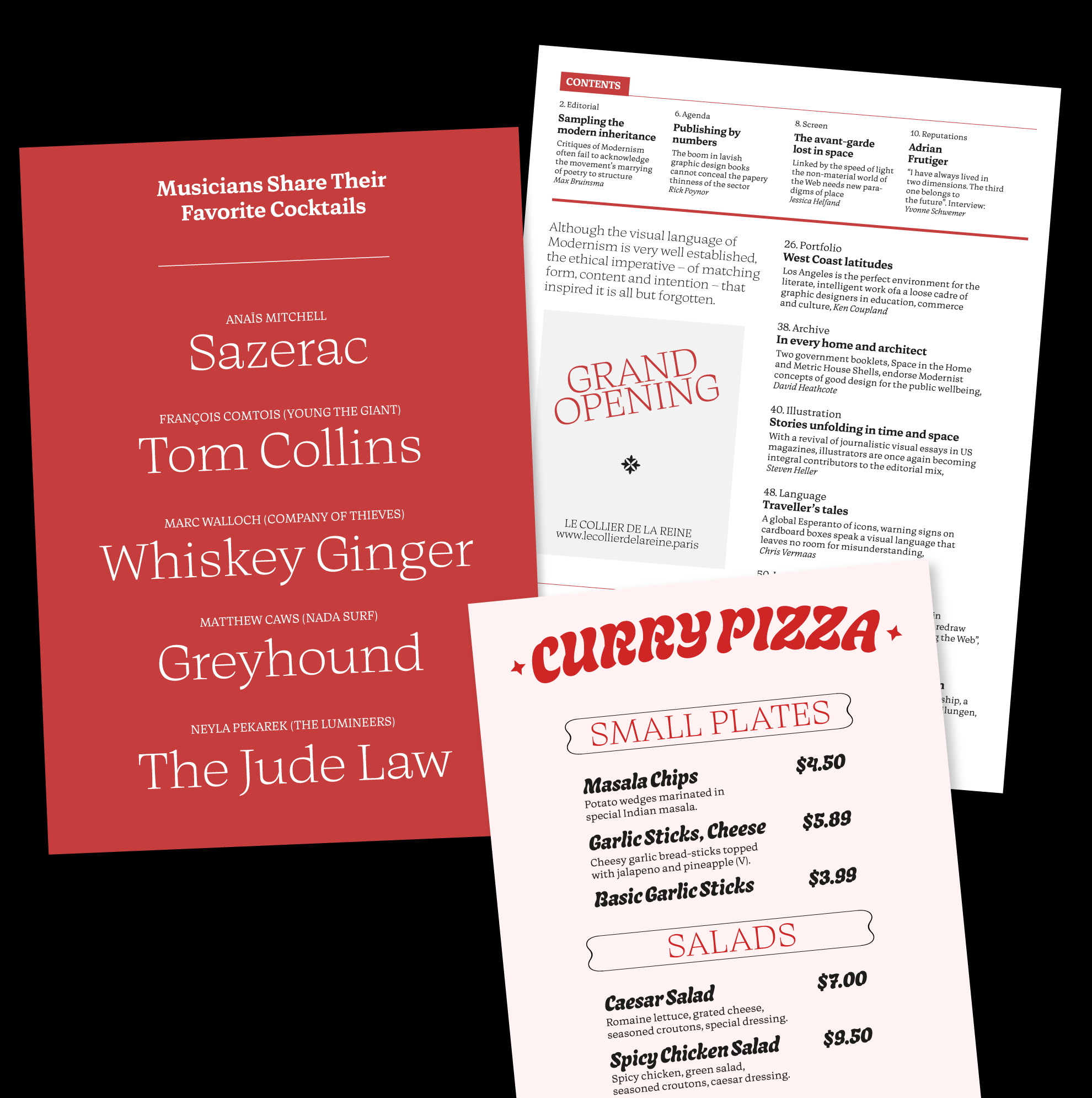
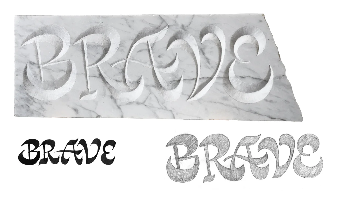
Instead of stretching the concept of a family, Lora worked on a group of different proto-families, developed in parallel. Rubina consists of Bold Display, Light Display, Regular Text, Italic, and Bold and it was inspired by the brush and a stone carving design. The diverse family members are developed to work together and they enabled very diverse in-use examples with complex typographic layouts and hierarchies. The Bold Display style is different from the rest and weight variations will be developed. The italic introduces more sharpness, edginess, and speed in the text. The wider proportion of the Text styles offers legibility in small sizes down to 7-8 pt. The stems are slightly flared in the Light, Regular and Bold. In the Bold Display, the flarness is emphasized by the sharp corner in the stem.
Mello
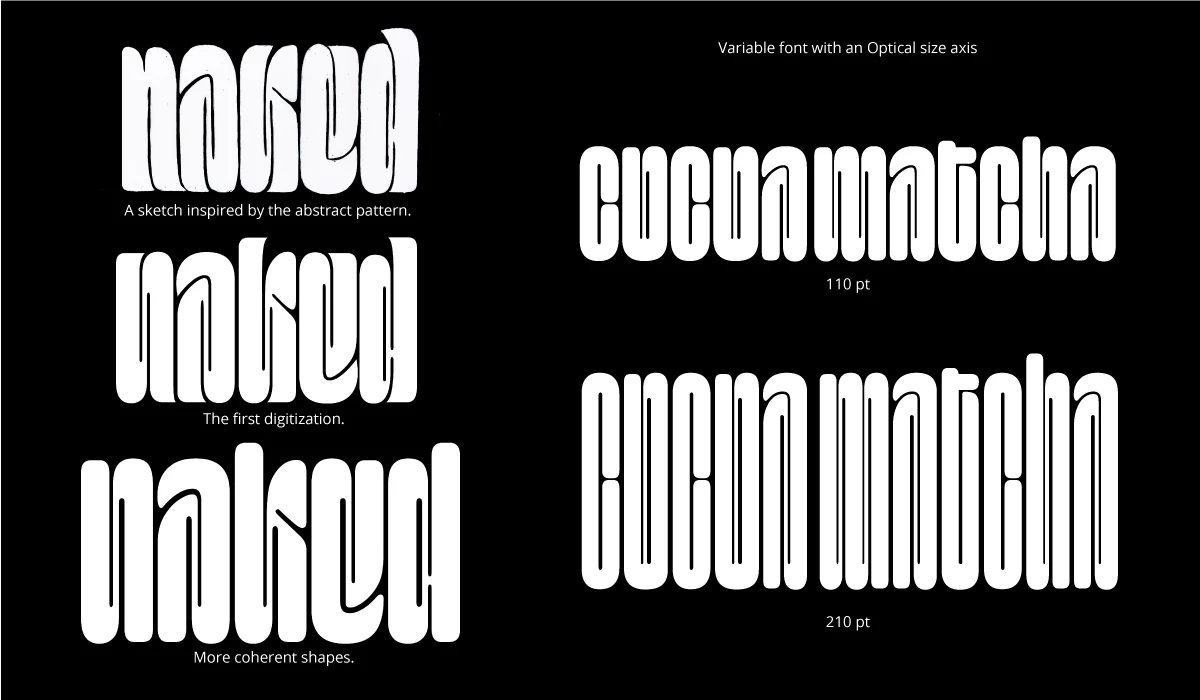
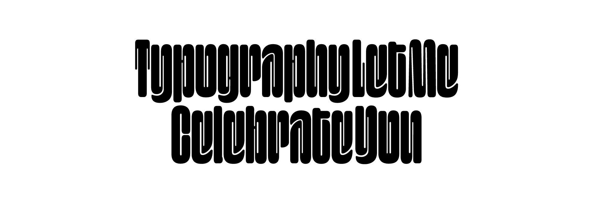
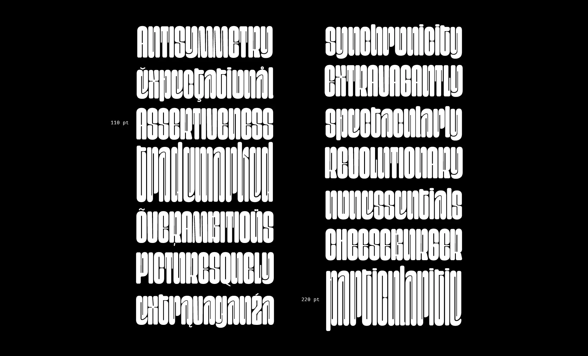
Mello is a Variable Font with an optical size axis for 110 pt and 220 pt, and Lora plans to expand to a third size for 55 pt. It is a typeface born out of abstraction that offered the space for interesting shapes and the creation of a strong vertical rhythm. It works very well for big titles and posters. Lora’s decision to continue with Mello was out of her curiosity to test Variable font possibilities.
Lora Shtirkova
Lora Shtirkova is a Bulgarian graphic designer, specialising in type design, lettering, and calligraphy currently working as a freelancer. Her strong interest in calligraphy led her to the master Type and Media. She won a scholarship for her studies in 2021/2022 from Tuk-Tam – a Bulgarian organisation that supports international education. During her bachelor, she studied both in Bulgaria and Spain. Her previous experience with typography and layouts inspired her to create a diverse “family” of typefaces for different purposes and sizes.
Overview


Process
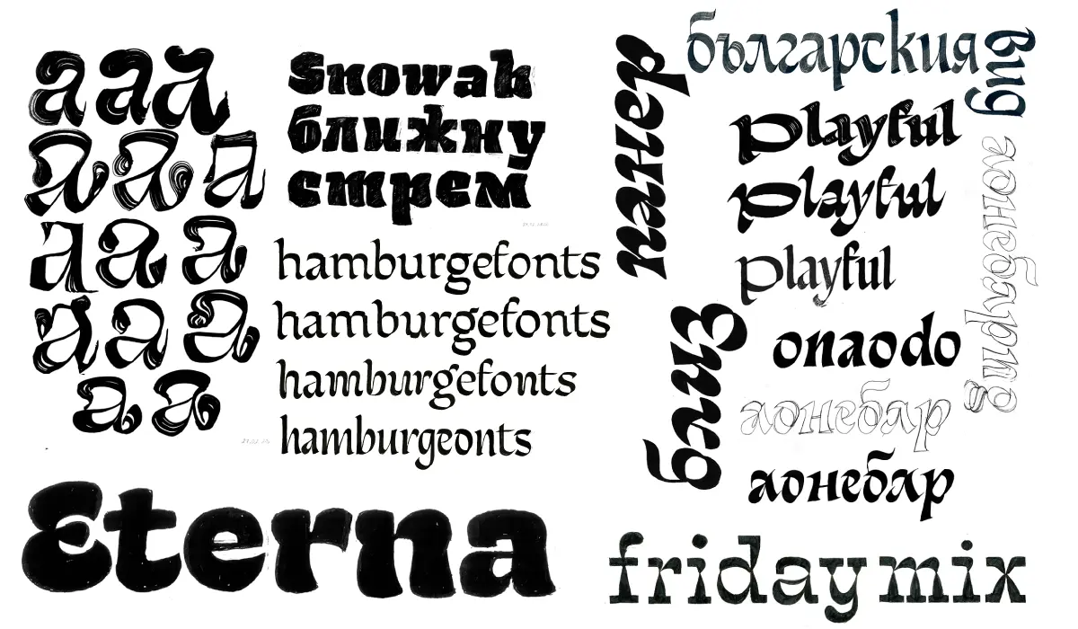
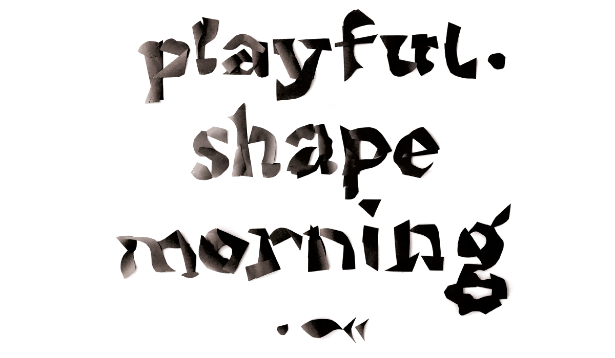
At the beginning of the second semester, I played a lot with the brush discovering different rotations, pressure, angles, and contrasts. One of my observations is that this tool gives flexibility while exploring interesting new shapes. Simultaneously, I played with Cyrillic forms. The Stone Carving influenced my approach to shapes and drawings throughout the semester. I was looking to get free from what I already learned to draw, so I used the paper as another source of inspiration and a way to free my mind and had. I would cut the paper, then quickly arrange it into words and then draw something fast. The process of finding the best shapes for Rubina is similar to the Stone Carving process – the shapes weren’t there in the beginning but slowly they were becoming more coherent and clear.
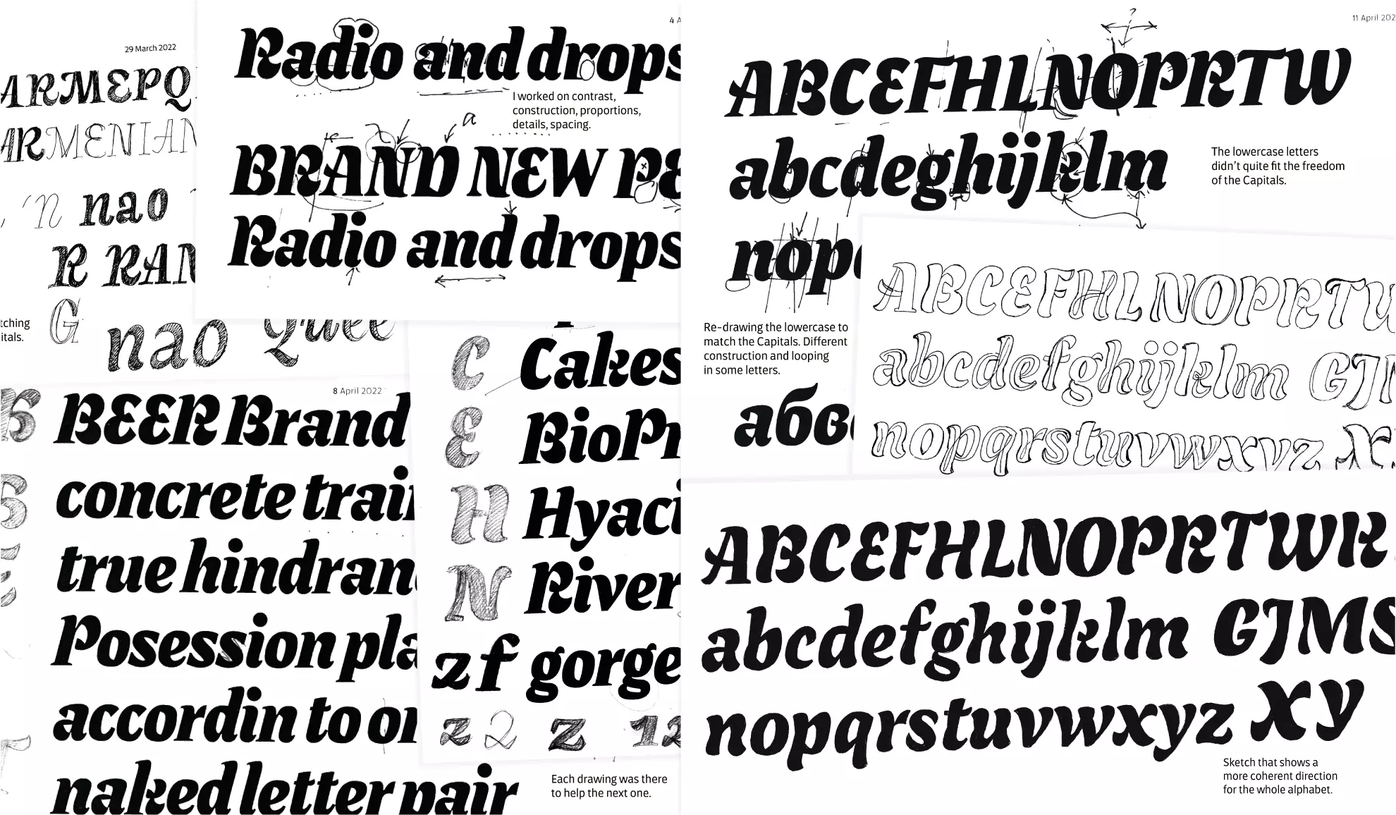
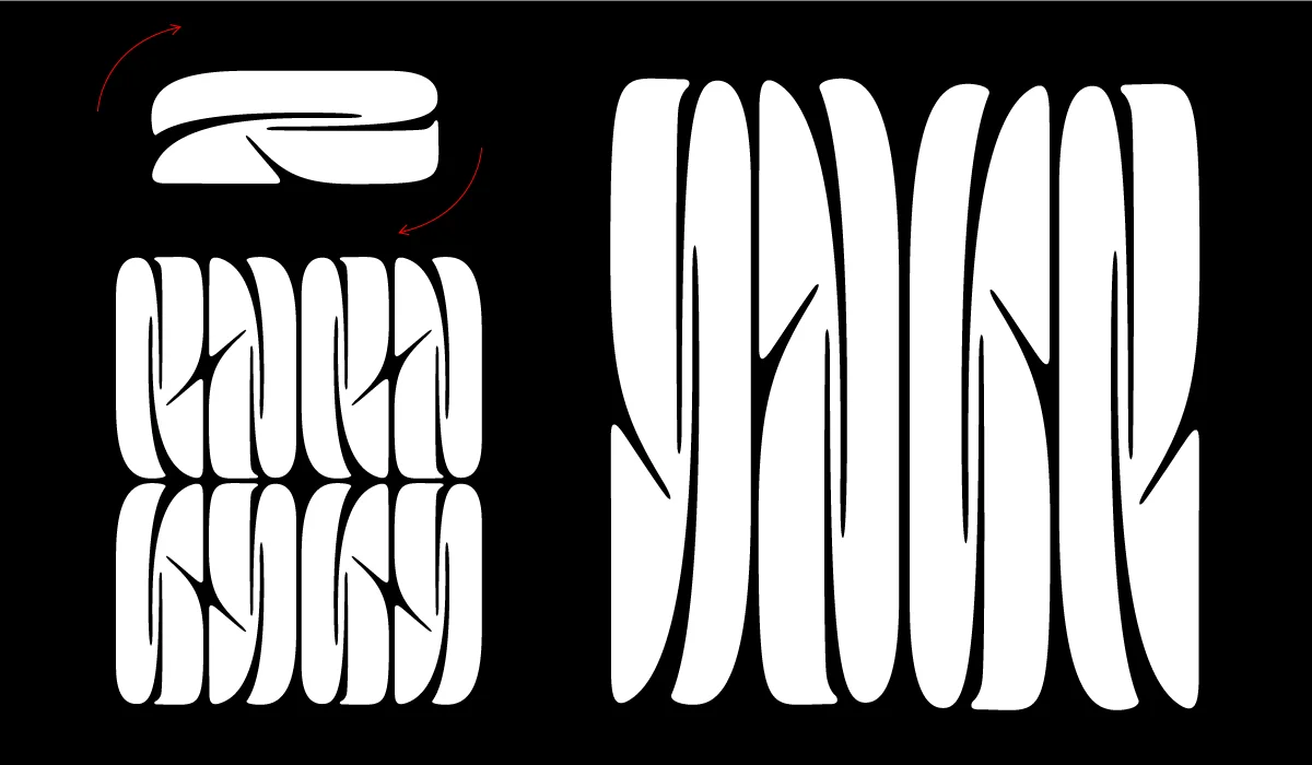
Mello was born out of abstraction and it was developed in parallel with Rubina. I played with the number 2, rotated, and repeated it to create an abstract pattern. It is what inspired me to draw the letters. During the process, I explored different companions that could go well with it, mainly sans-serif types. At a certain point, I decided to keep just the display Sans and to continue exploring what this typeface could be. During the process, Mello became a variable font with an axis for optical sizes 110 pt and 220 pt. Mello was developed in parallel with Rubina.