

Stein
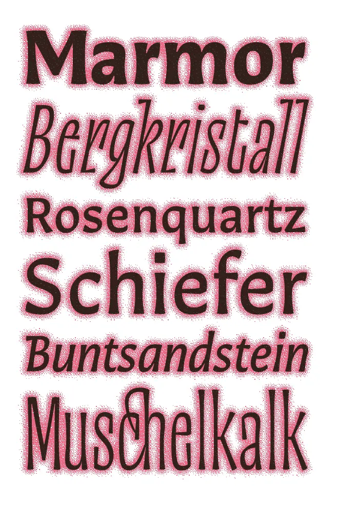
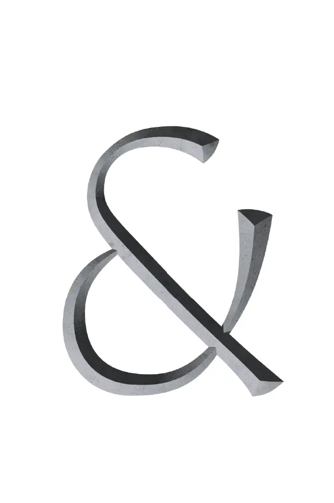
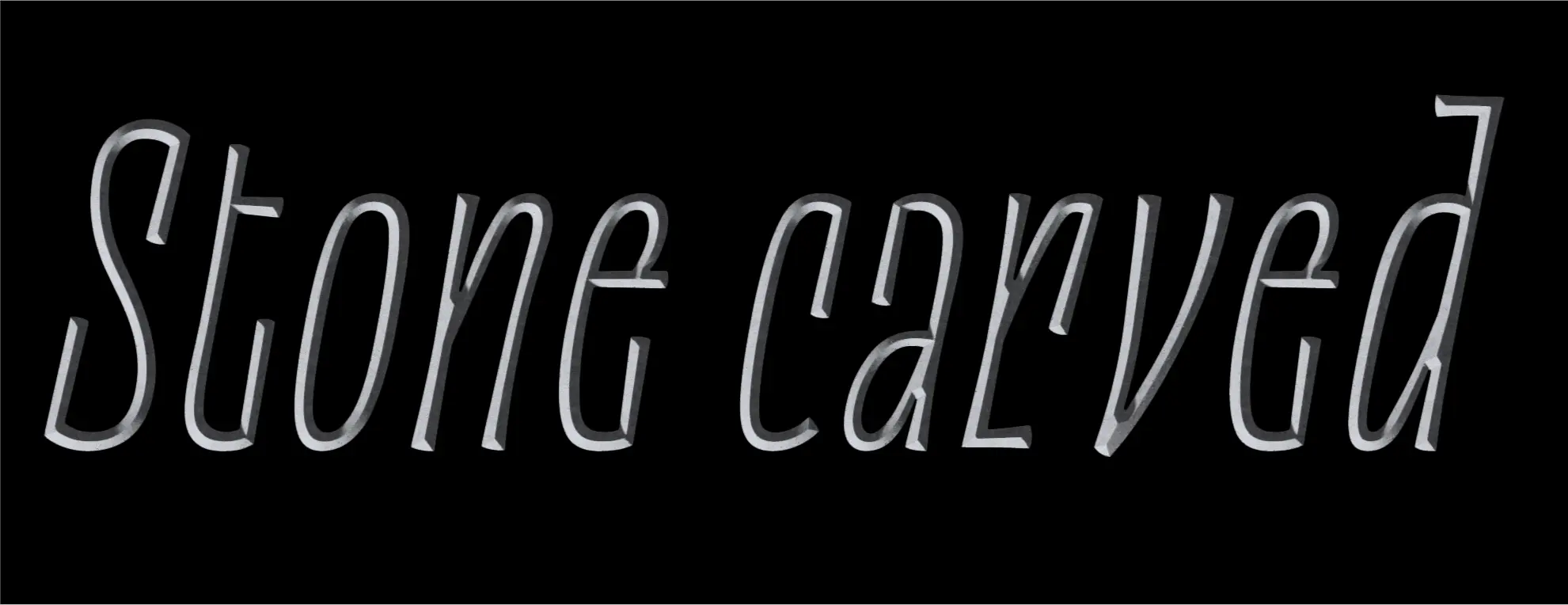
Stein is a play on german type design from the early 20th century. The flared Display style was developed from a stone carving made in Françoise Berserik's class. This was later accompanied with a toned down, but still quite expressive text. The family seeks inspiration from historical designs without romanticising them, but instead creating something new.
Jakob Fangmeier
Jakob Fangmeier is a german type designer and type nerd. After a master in ethics in design in Würzburg he went to Type Media to pursue his interest in shapes. He tries to look at type holistically, being interested in type design, typography, printing, coding, and teaching.
Overview




Process
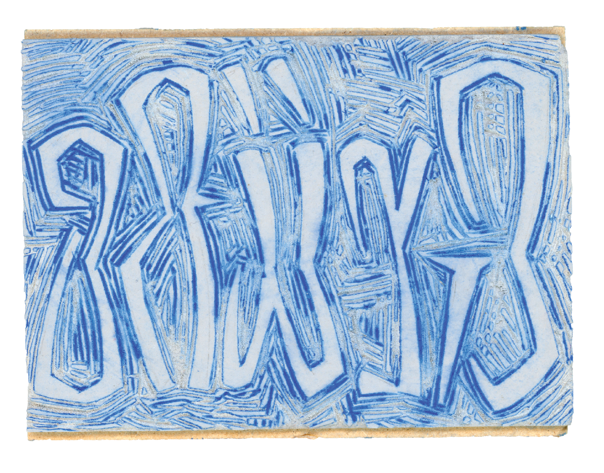
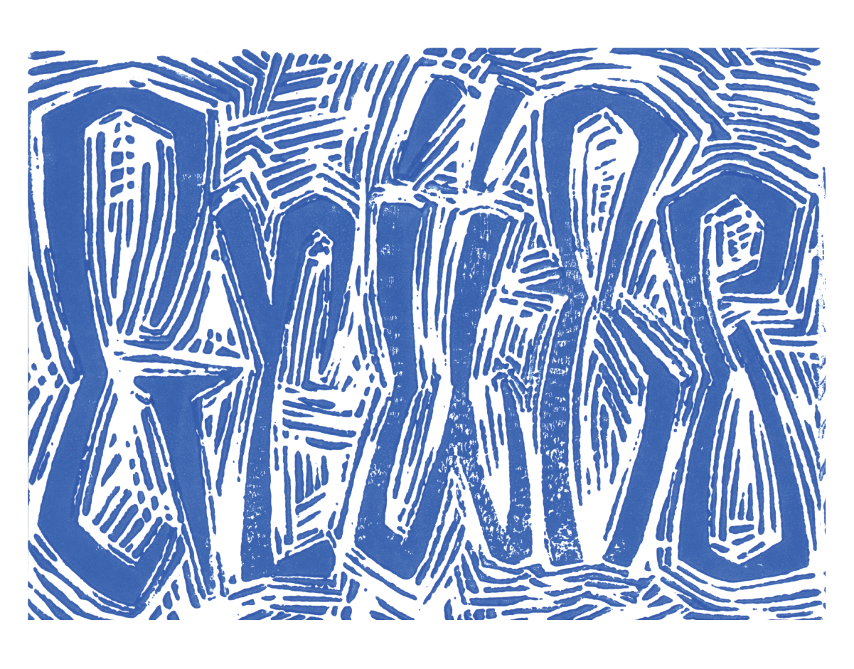
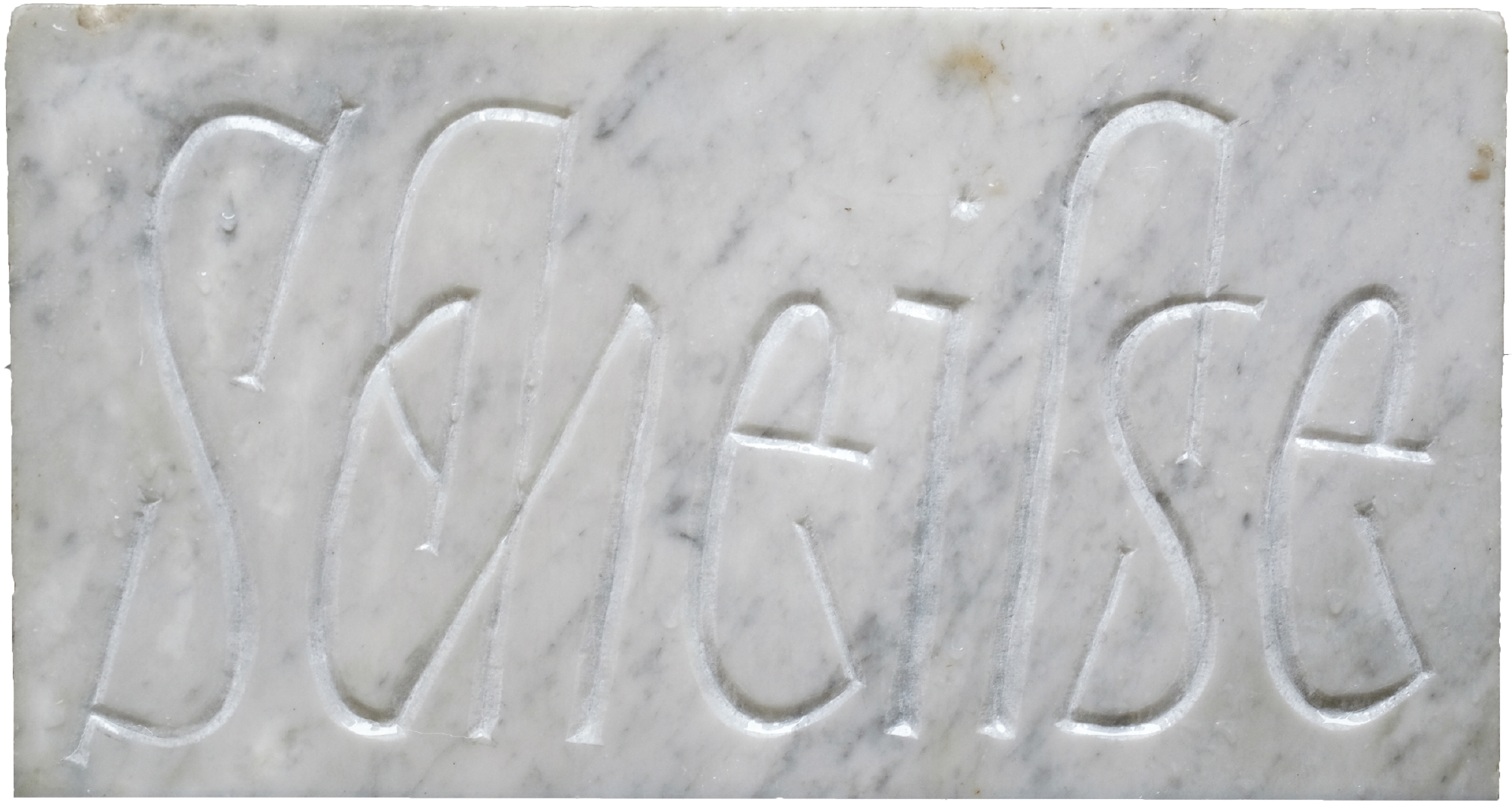
The process was very non linear in the beginning. I used the term „black letter hybrid“ as a starting point to create drafts in very different directions. I researched and tested different kinds of rhythms in typefaces to discover interesting results. For the longest time during the final semester I kept three completely separate designs, before deciding on one of them to develop further.
In the end I landed on lively condensed display type that gets especially expressive in the italic accompanied by a more toned down text face, with all the styles needed for good type setting.
